Recently, I added a group of photos to my Facebook Page. Facebook popped up with a little window that hid part of my screen and urged me to make my album “shareable” so my friends could post pictures to it as well. And Facebook, of course, gets to collect more information about my friends. Your options are “yes” or leave this ugly window open on my screen.
Facebook should add another option: GET LOST.
Come to think of it, most software and websites should have that as a standard option.
Put all your music into my library so you have to use my app to find it? GET LOST.
Update Firefox so you have to wait five minutes before you can google whatever it is you’ve forgotten you want to google? GET LOST.
Install a new layer on your browser so I can intercept all your search requests? GET LOST.
Update your Flash Player with the newest, most secure, sexiest and fastest new Updater? GET LOST.
Sign in to Google? GET LOST.
Let us update you when new features are available? GET LOST.
Sign in to watch videos your friends liked on Facebook? GET LOST.
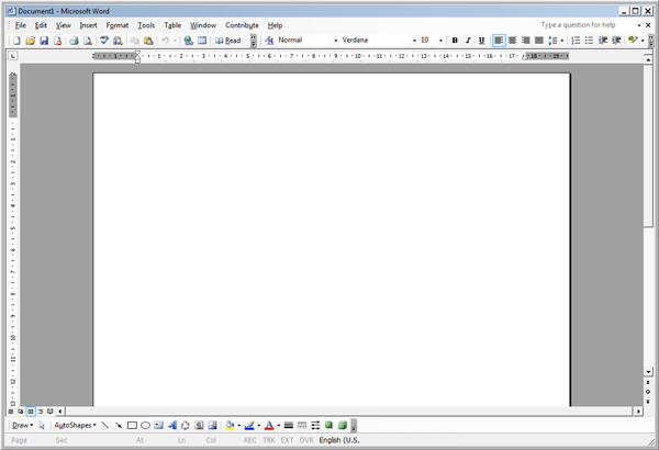
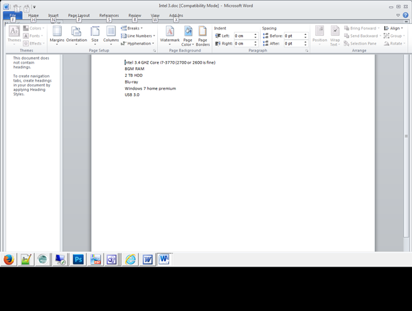
It is now 2013: I still use Word 2003. Why? Because, for one thing, I want to write. I don’t want to create a Christmas Card every time I develop some actual content.
Below, the Word 2003 and Word 2010 screens, respectively.


Going back to Office 2003.
Office 2007 and 2010 must be the worst design updates in software history.
Would Mighty Microsoft really make a mistake like that? Wouldn’t they carefully test the new interface to make sure users liked it and found it more efficient and user-friendly? Oh, they probably do, to some extent. But that’s not the driving force behind most upgrades.
Every four or five years, Microsoft must persuade you to upgrade or they lose a massive income stream. To persuade you to upgrade, they must make it difficult to run older versions of the software on the new operating systems that come with all new computers. Then they must persuade you that there is something new and better about the upgrade.
In every design aspect of any product there will be a point where an optimum design has been reached beyond which only minor tweaks and enhancements will actually provide anything of value. Office seemed to me to have reached that plateau at version 2003. The tool bar on the new version is a mess.
But then, Microsoft never cared at all for the power user. The very last thing they, or Adobe, or Sony, want to give the user is the power to control his computer environment. They don’t want you to know where your files are actually located, or where your templates are, or how to turn useless automated features off. They want you to enter the womb, attach the umbilical cord, and keep funneling those dollars into their coffers while you are desperately dependent on them to maintain the web of fonts and links and chains and networks that let you find your file.
There is no such thing as a desktop. It does not exist. There is a hard drive and a motherboard and software. The desktop itself is a fictional creation of Microsoft’s to convince you to let them manage your files, which it then hides from you in folders you can’t locate and can’t efficiently back up.
And if the computer is “My Computer” why is Microsoft trying to shove it’s bizarre file organization ideas down my throat? Why does it allow applications to store configuration files not only in the Program Files\application\whatever folder but also in the users\username\app data or app data\roaming folders? So if you fix a bad dll you might not know it: a duplicate dll might very well be sitting in another folder somewhere. This happened to me recently: I spent hours trying to solve a problem only to realize that there were two copies of the same file in two different sub-sub-sub-folders, and I was fixing the wrong one.
After all this time, and more than 15 years after the atrocious Windows 3.1 debuted, Microsoft still sucks.
